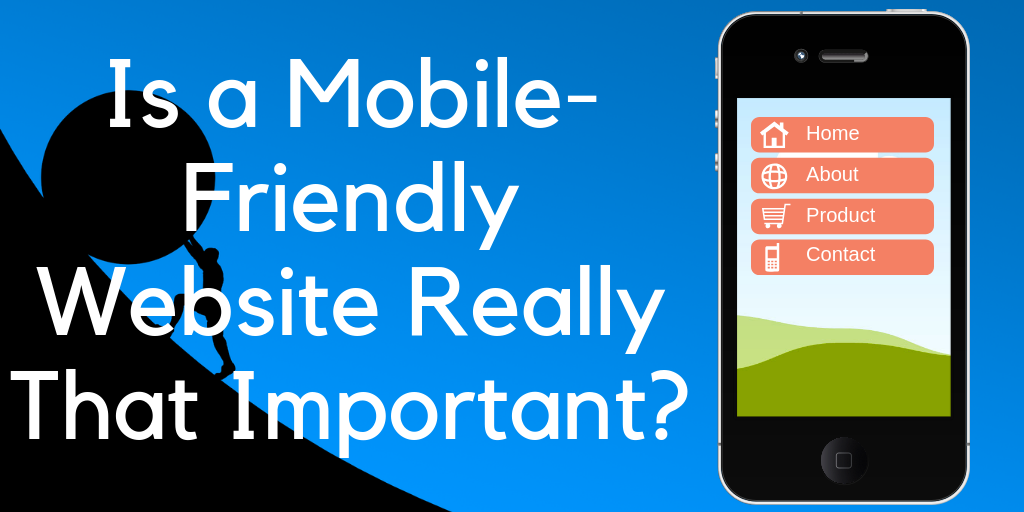
Why have a mobile friendly website?
Is it really all that important? Can you get away with just a regular old website? And besides… What the heck is a mobile friendly website anyhow?
I'm sure you've heard the term before "mobile friendly", or maybe "mobile optimized", or even "mobile first". There are various terms out there but they all refer to the same thing, which I'm just going to refer to as mobile friendly from here on.
The truth is that, while you don't absolutely need a mobile friendly website, it can be a big help and if you don't already have one then you will likely notice big differences by converting yours to a mobile friendly version.
In the rest of this short article I will be going over what exactly a mobile friendly website is, why this is important, how to find out if you have one, and if you don't a quick fix to the problem.
What Is a Mobile Friendly Website?
Okay, so what exactly is a mobile friendly website well… In simple terms it is just a website that is optimized for mobile devices, meaning that people can visit your website from smart phones and tablets without any problem.
But what is it about certain websites that makes them mobile friendly and others that make them not so friendly?
Below I have a list of some of the top criteria for a site being considered mobile friendly.
What makes it mobile friendly?
1) Pages Are Responsive
The number one criteria that a website must meet to be mobile friendly is responsiveness. But what do I mean by this?
When I say that pages are responsive, I am meaning that the different pages of a website respond to the varying sizes of screens.
If you were simply to take the view of a website from a desktop screen and make it smaller so that you can see on a mobile device, this would be extremely "un-user-friendly". It would be very difficult for visitors to see what they are doing and they would have to be constantly zooming in and out, scrolling around in every direction, and it would just be a mess.
However, this is the problem that some sites have. If you go to a website that is not mobile friendly, you are just viewing the website on a mobile phone as if you were doing it on a desktop computer.
A mobile friendly website will reformat everything to make the experience much more simple. You will be able to simply scroll down on your mobile device without scrolling side to side, having to zoom in and out, and all that nonsense.
Can you simply adjust the settings on your website to make it mobile friendly? The answer is no. Unless you are a master coder, you will have to get a theme that is already mobile friendly, which I will discuss shortly.
2) Fonts Are Easily Readable
Another aspect to the mobile-friendliness is readable fonts. This is something that you can manually adjust on your website and that everyone should be able to do on their own, if your theme allows it. But not all themes allow you to change the font style. That said, the default fonts for most themes are usually easy to read and are good to go.
The reason that font choice is a lot more important when it comes to mobile devices is simple… They are much smaller and that is already a disadvantage when it comes to readability.
3) Image Display
Having optimal image display is also something that you could say is part of the criteria for being mobile friendly.
If you view your site on a mobile device, does it mess up the images? Does it make them incredibly hard to view?
This is something else that comes with the theme you have installed on your website. Some themes, such as the one I am using for example, optimize image placement and size for varying mobile device sizes.
4) Navigation
Having mobile friendly navigation is also key. Being able to navigate a website on a smaller screen makes things a bit more difficult, so making it as easy as possible for visitors to get to where they want to go is a necessity.
Menus are very important when it comes to this. Have you ever been to a website on a mobile device that has some massive menu that takes forever just to look through? And maybe it took you 10 minutes just to find the menu in the first place? Yeah… This is not what you want.
Often mobile friendly websites will have a little menu icon that visitors can click on to expand a full menu. This is what you want because the menu is out of the way and allows for the screen, as small as it already is, to be filled with other things, yet it can be clicked on and expanded by the user at any time.
This is something else that just comes along with a mobile friendly website theme. If you are viewing this post right now on a mobile device then you should see something like what I am talking about because my website is mobile friendly.
5) Other Ways to Keep It Friendly
The truth is that there are many ways to keep your site mobile friendly, besides that of simply using a mobile friendly theme. I'm not going to go over all of them, but another good thing you should think about is keeping your paragraphs on the shorter side in breaking up your ideas and thoughts.
As I already went over, reading things on a small device is already hard enough, you don't want to make things harder than they need to be. You don't want to jumble everything together into one massive paragraph that might take a couple minutes to scroll through. Break things up into nice, easy to digest, bite sized pieces.
This is something you want to do regardless. It doesn't really matter if people are on mobile devices or not, but I would say that it is a bit more crucial when it comes to mobile users.
Why It Is Important
So why is this also important? I mean… I get it… If people visit my website from a mobile device and they have a rough experience than they are more likely to leave in a short period of time. But is it really all that important?
The answer is Yes, it is.
According to Statista, the global mobile internet user population was a massive 3.9 billion in October of 2018. In North America 38.67% of all Internet traffic came from mobile devices, 37.08% in your app, and as high as 61.09% in Asia.
And if you think that is a lot, get this… The traffic coming from mobile devices is projected to increase astronomically by 2021.

What the chart above shows is the amount of "exabytes" of data used on average per month for a given year. In 2016 the global mobile traffic added up to 7 exabytes of data per month, but in 2021 it is estimated to increase by 7x that amount.
Now you don't need to know what exactly an exabyte is or anything… The point is that mobile traffic is increasing a lot, all across the world, and if you want your website to be effective for whatever its purpose is, you are going to want it to be mobile friendly.
You Don't Need One If...
This section I put here just kind of as a joke. The only time you don't need a mobile friendly website is if you want to have some crappy website that many people can't even read and leave soon after they come across it.
But who would want that?
How to Find Out If You Have One?
Don't know if your website is mobile friendly or not? Well don't worry, finding out is pretty darn simple.
All you have to do is go to https://search.google.com/test/mobile-friendly, which is a free tool provided by Google, in order to find out.
When you click the link above and go to this website you will see the page displayed below where you will be prompted to enter the website you want to test… (You can enter any page on any website that you want to test)

Then you simply click the button to run the test and it will analyze your website. This may take a minute depending on the size of your website.
Then you will get the page shown below. It will either say your page is mobile friendly, or is not and it will also display an image of what your site looks like on a mobile device…

As you can see above, it did tell me that I have "page loading issues", but they turned out to be nothing for me to worry about… Just some scripts and stylesheets that didn't load, not actual pages.
Not Mobile Friendly? Here's a Fix
Years ago when smart phones were just becoming popular, it was rather difficult to make your website mobile friendly, simply because there weren't all that many mobile users yet and no one really cared about it, but nowadays it is pretty darn simple.
There are lots of different mobile friendly themes that you can get out there, both free themes and paid themes. A good mobile friendly theme will be responsive so that no matter what size of screen a visitor is viewing your website on it will be user-friendly, it will optimize image size for any device, it will make navigating your website easy, and so on.
Now I only have WordPress websites, so I only can speak for them, but all types of websites will have mobile friendly themes. And in case you are wondering, I use Thrive Themes. They have a variety of different mobile friendly themes that are conversion focused and work great.
So in closing, I hope you understand the importance of having a mobile friendly website if you didn't already. This is a big deal and not having one can massively affect success when it comes to the need to increase website conversions, whether it be selling a product, promoting a brand, getting people to opt into a mailing list, etc.
If you have any questions or comments, please leave them down below and I'll get back to you as soon as I can 🙂
My Make Money Online Guide

0 comments